Brew Can Co.

project overview
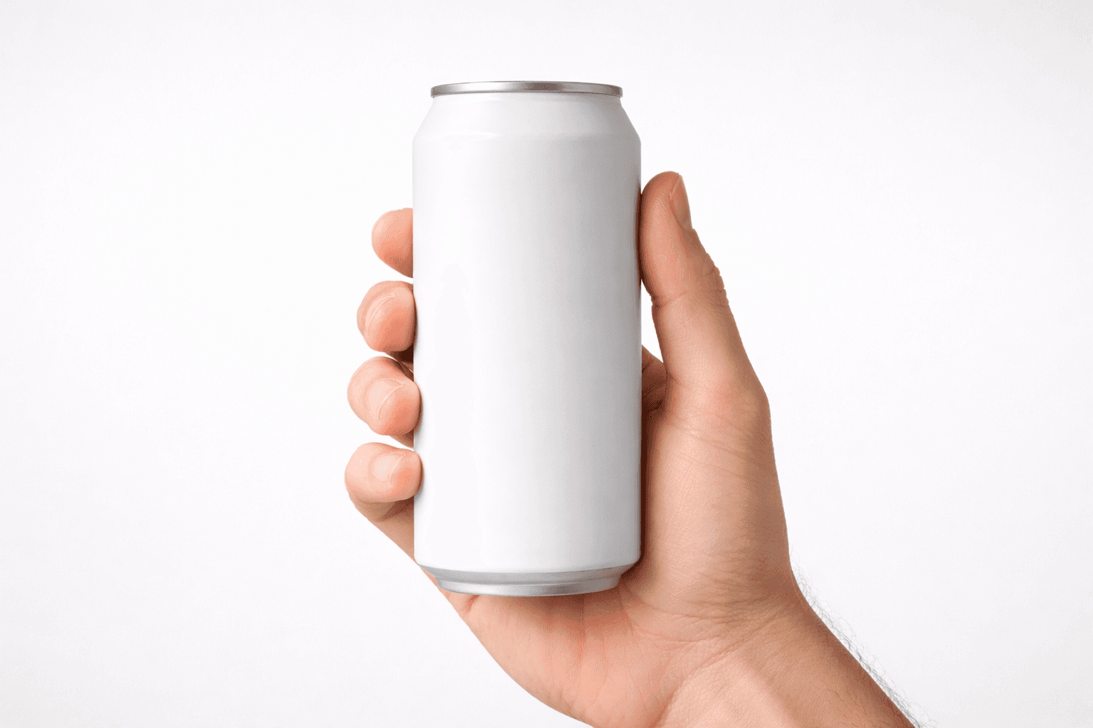
Brew Can Co. needed to stand out in a crowded coffee market filled with colorful, busy designs. I created a bold black-and-white identity that feels more like a premium art piece than a grocery store product, with a simple hand-drawn coffee cup that adds personality without clutter.
project type
Packaging Design
year
2024
my role
Lead Brand Designer
users
30,000
problem
lack of visibility and control disrupts group payments user research—via surveys and interviews—revealed several key pain points in the legacy app:
solution


competitive analysis

usesr research
frustration, time pressure, and limited control: key user pain points
To understand pain points in the legacy app, the research team surveyed 75 users and conducted 6 in-depth interviews. Recurring themes included: frustration with payments and receipts, time constraints, limited control and transparency in group interactions, confusion from unclear workflows, and inconsistencies across features. These insights directly informed the problem statement and guided the design direction.

Final Design